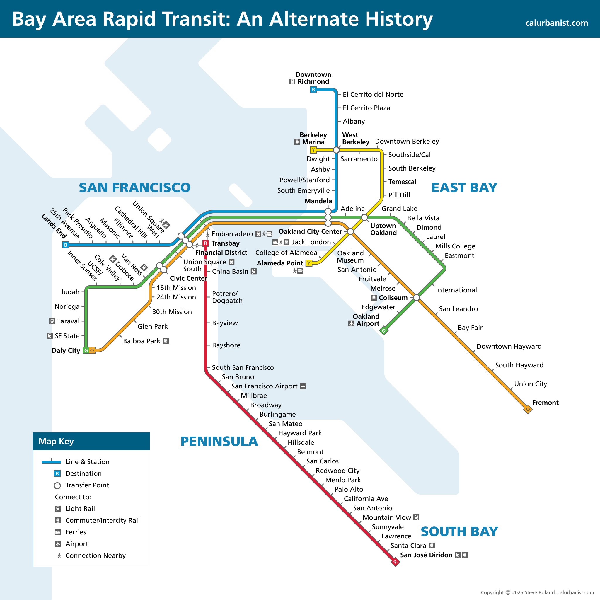
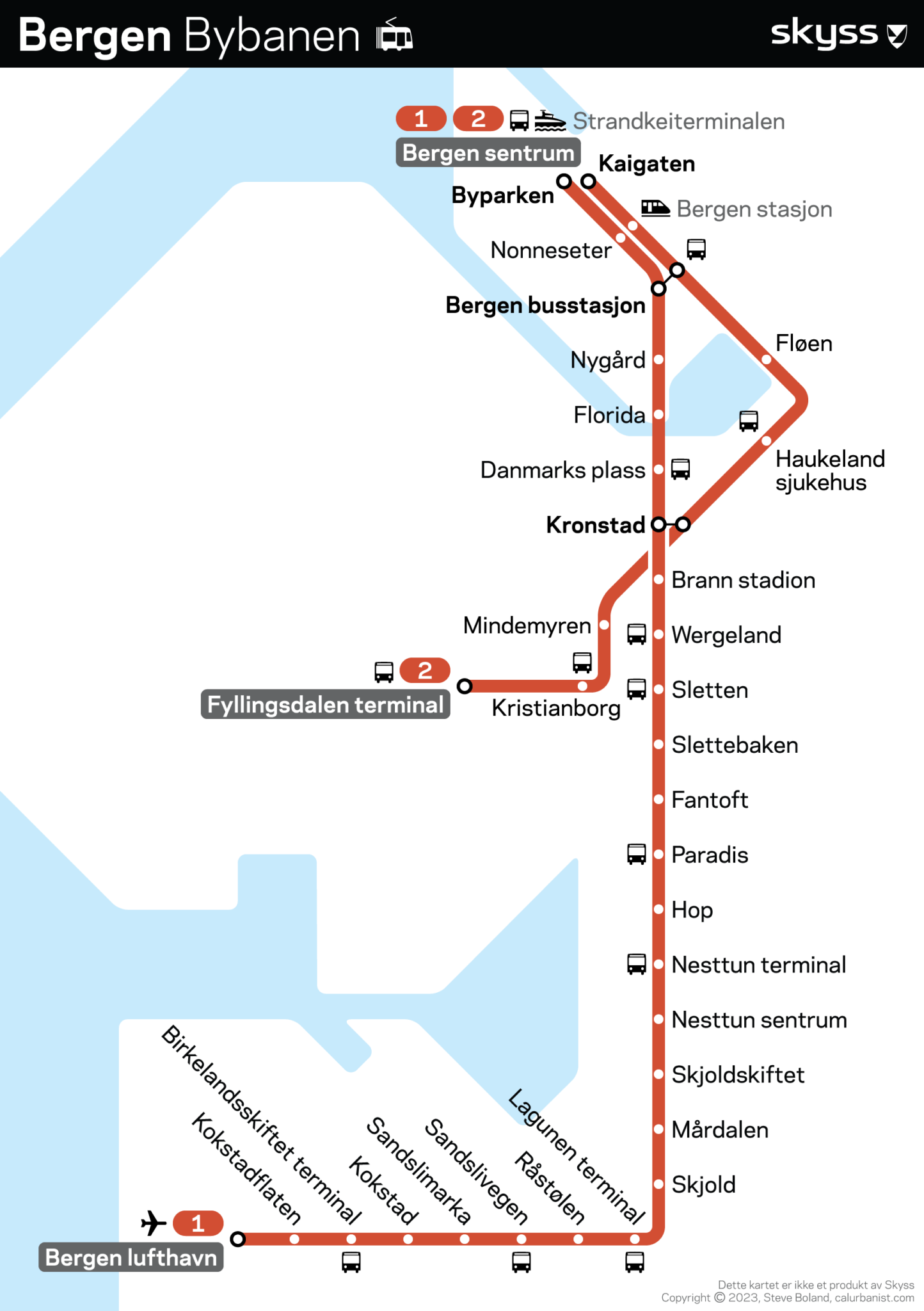
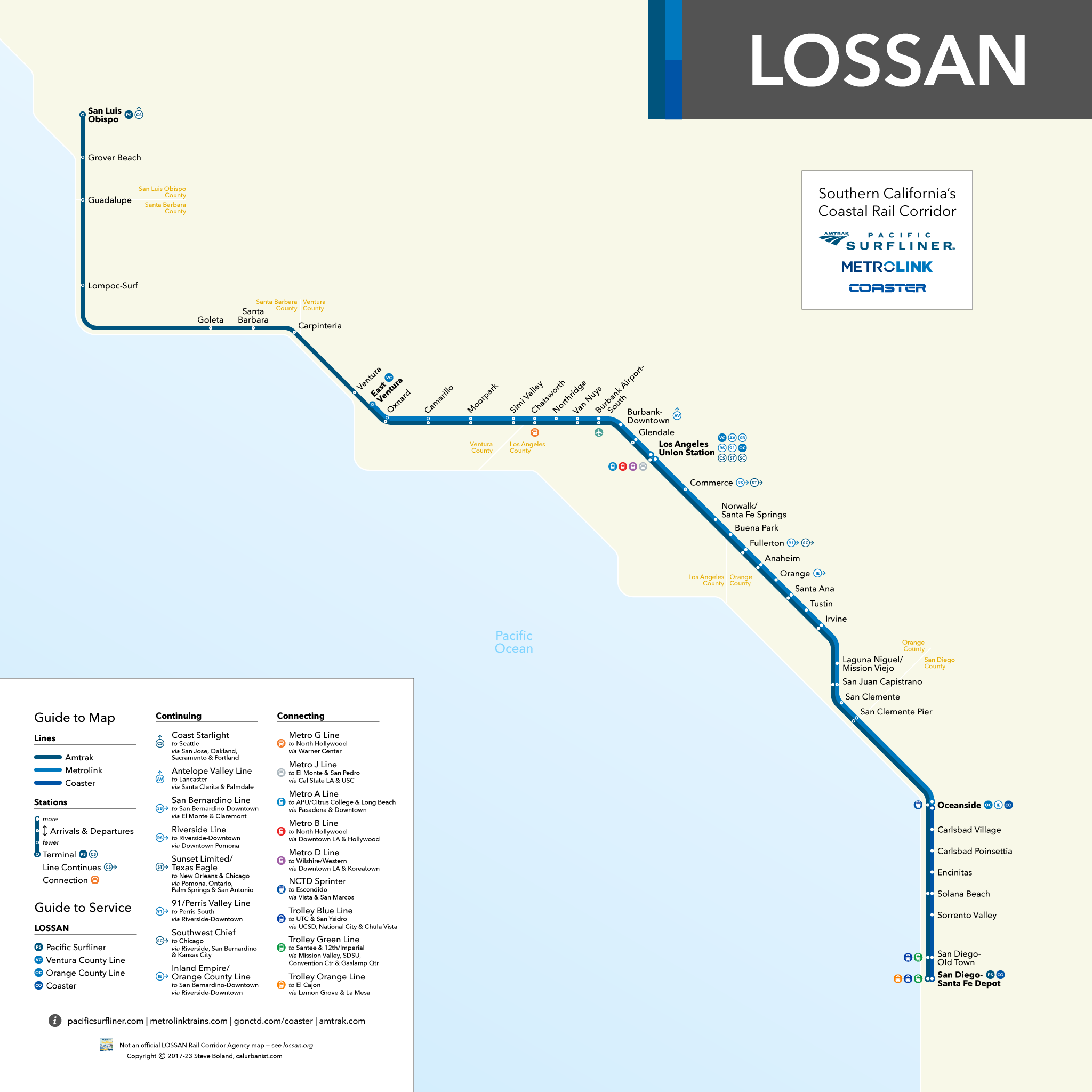
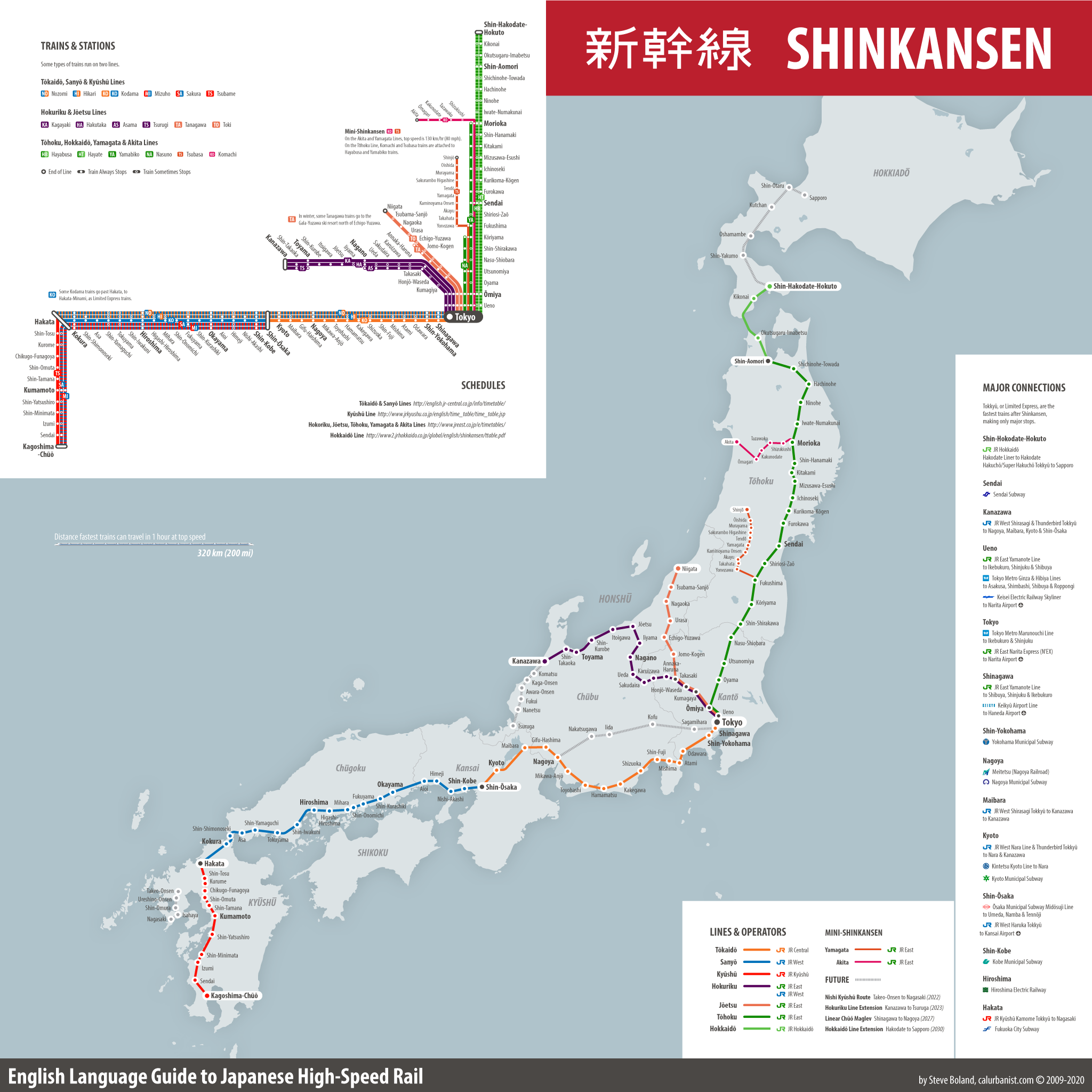
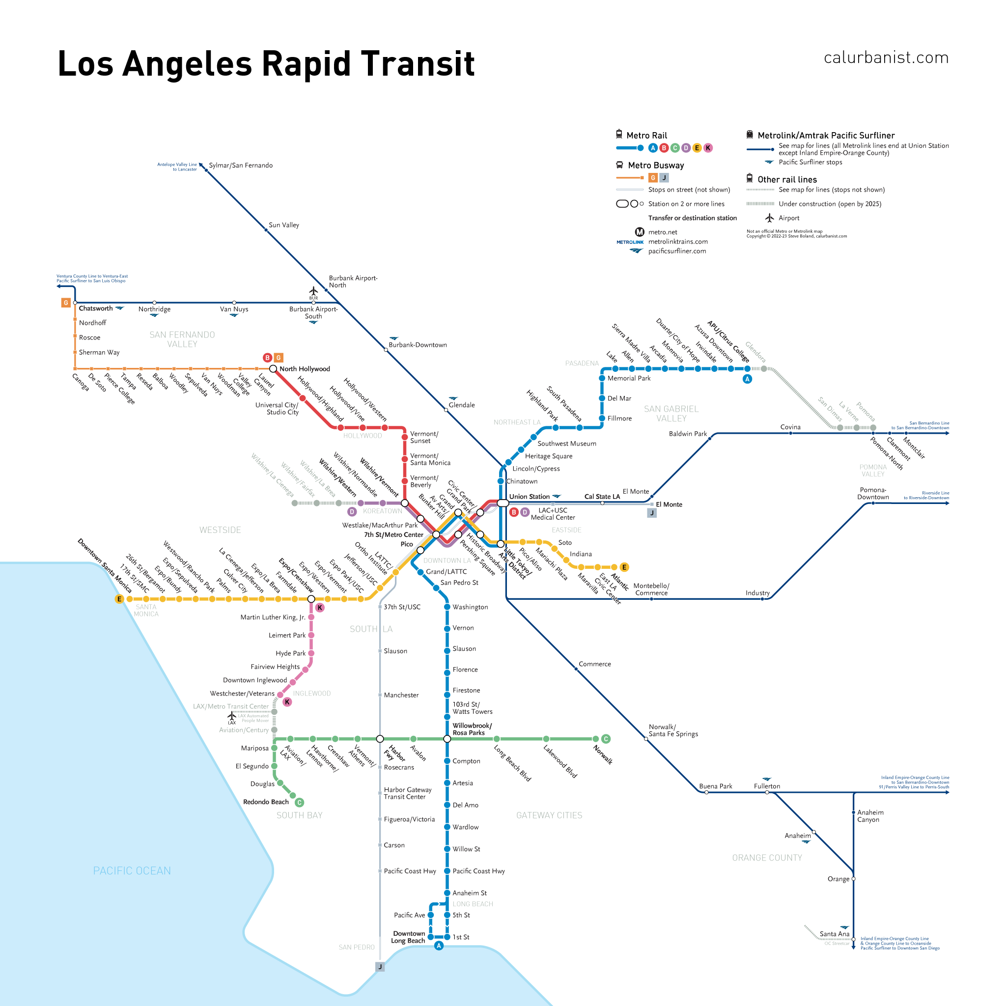
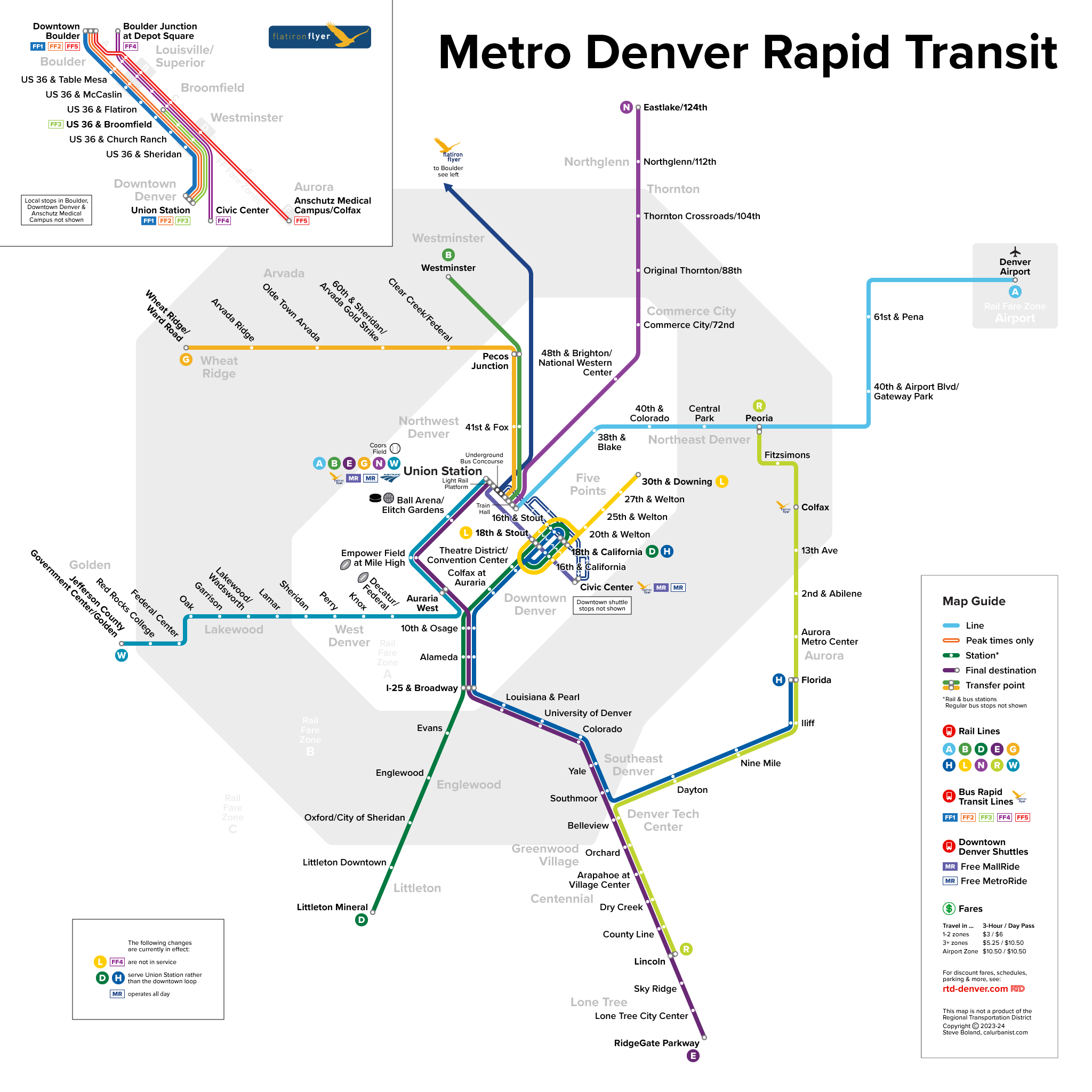
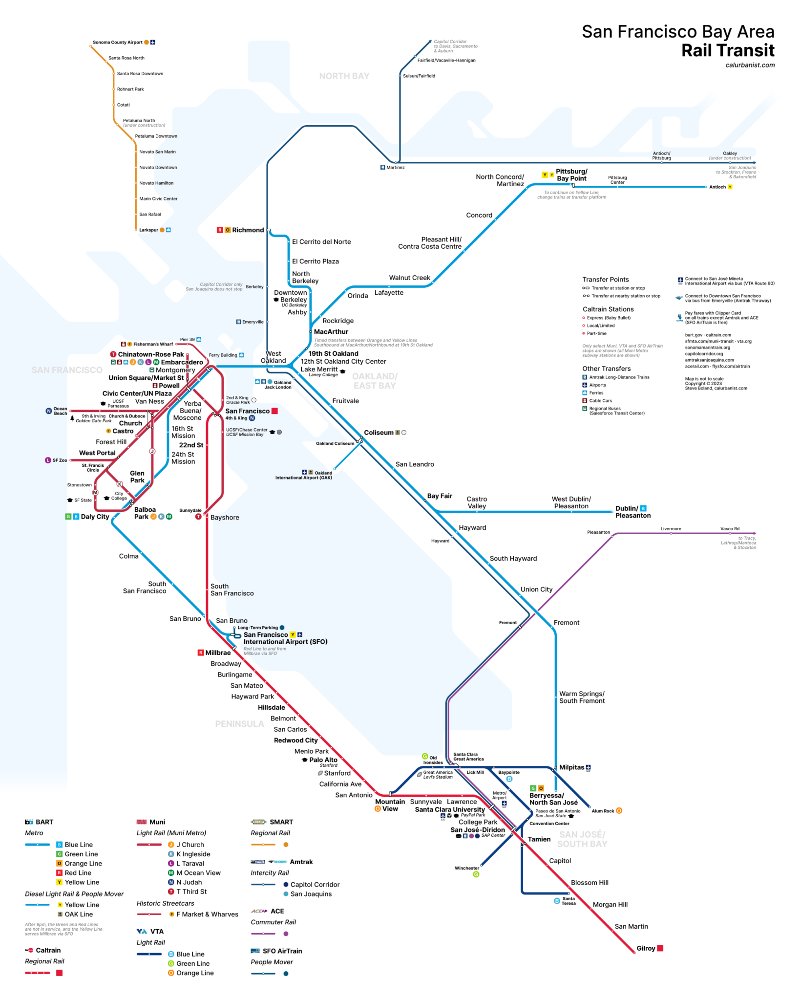
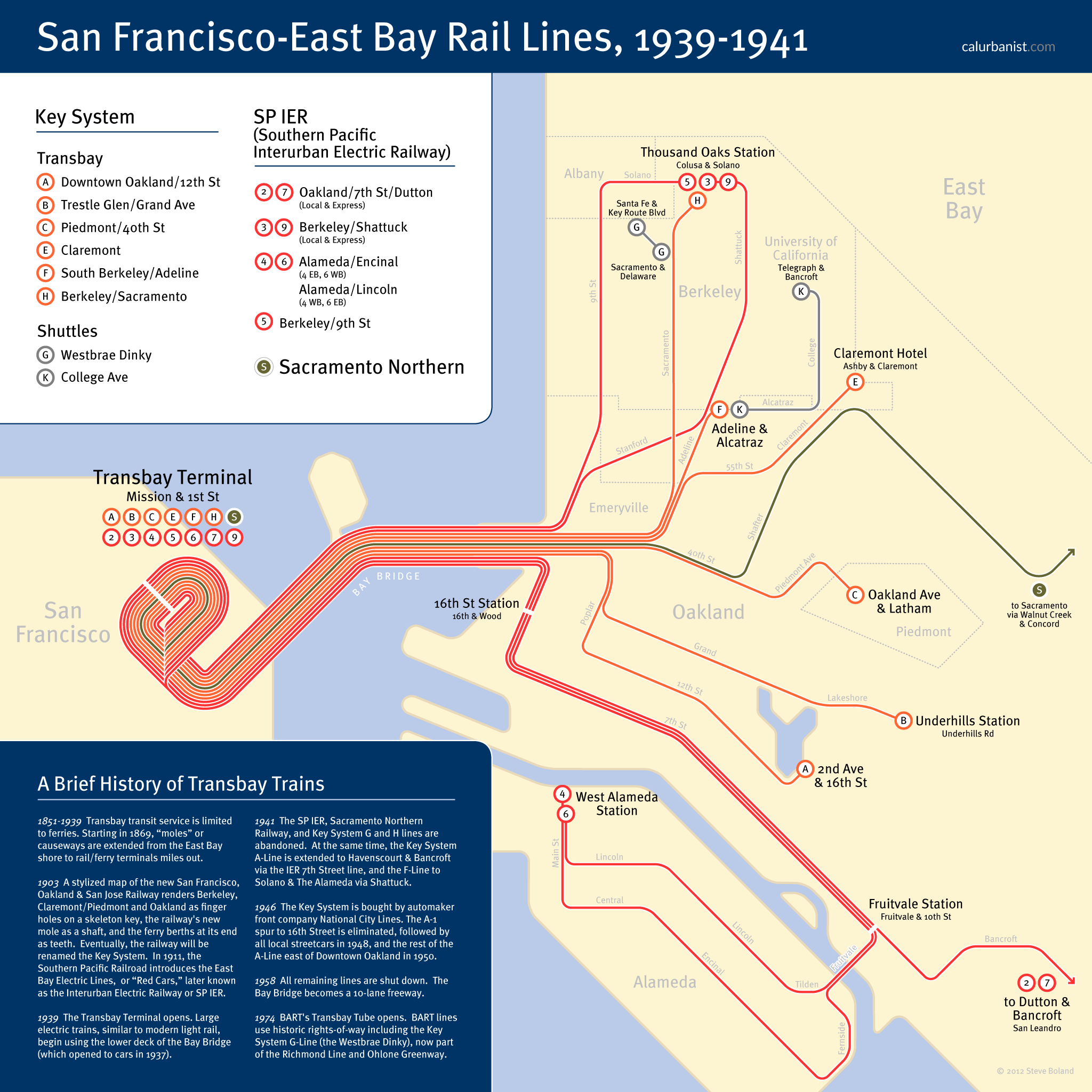
There are plenty of “fantasy” or “crayon” Bay Area rail maps on the Internet. You can find subways all over San Francisco; you can find urban rail in the rural North Bay (BART to Napa!). This map tries to be a bit more realistic. Don’t get me wrong — it imagines a different postwar political and cultural reality. But its starting point is a realistic scenario, a potential turning point: What if Contra Costa County, like San Mateo County before it, had opted out of the BART District before the vote that created it? What if BART planners had gone back to the drawing board, and sketched out a new proposal focused on the densely populated core of San Francisco and Alameda counties? What if that proposal had won? And what if BART had expanded over the years by investing less in suburban park-and-rides, and more in urban neighborhoods? What if, in other words, today’s BART looked more like another Great Society subway, the Washington, D.C. Metro? There are 40 Metro stations in the District of Columbia, which has a population of about 700,000 (and, granted, armies of federal employees — or at least it did). This map has 56 stations (vs. 19 today) in San Francisco, Oakland and Berkeley, which have a combined population of around 1.4 million (60 stations if you include Caltrain, as the map does — with, to be clear, existing Caltrain and not BART trains and tracks). That doesn’t tell the whole story; in the world of this map, most of the Muni Metro still exists. But the point is this: Isn’t this the sort of metro system the urban Bay Area should have, and could have, even given its location within California and America?
If you’ve made it this far and are still interested, click here and scroll down for more details.
Notes on Design
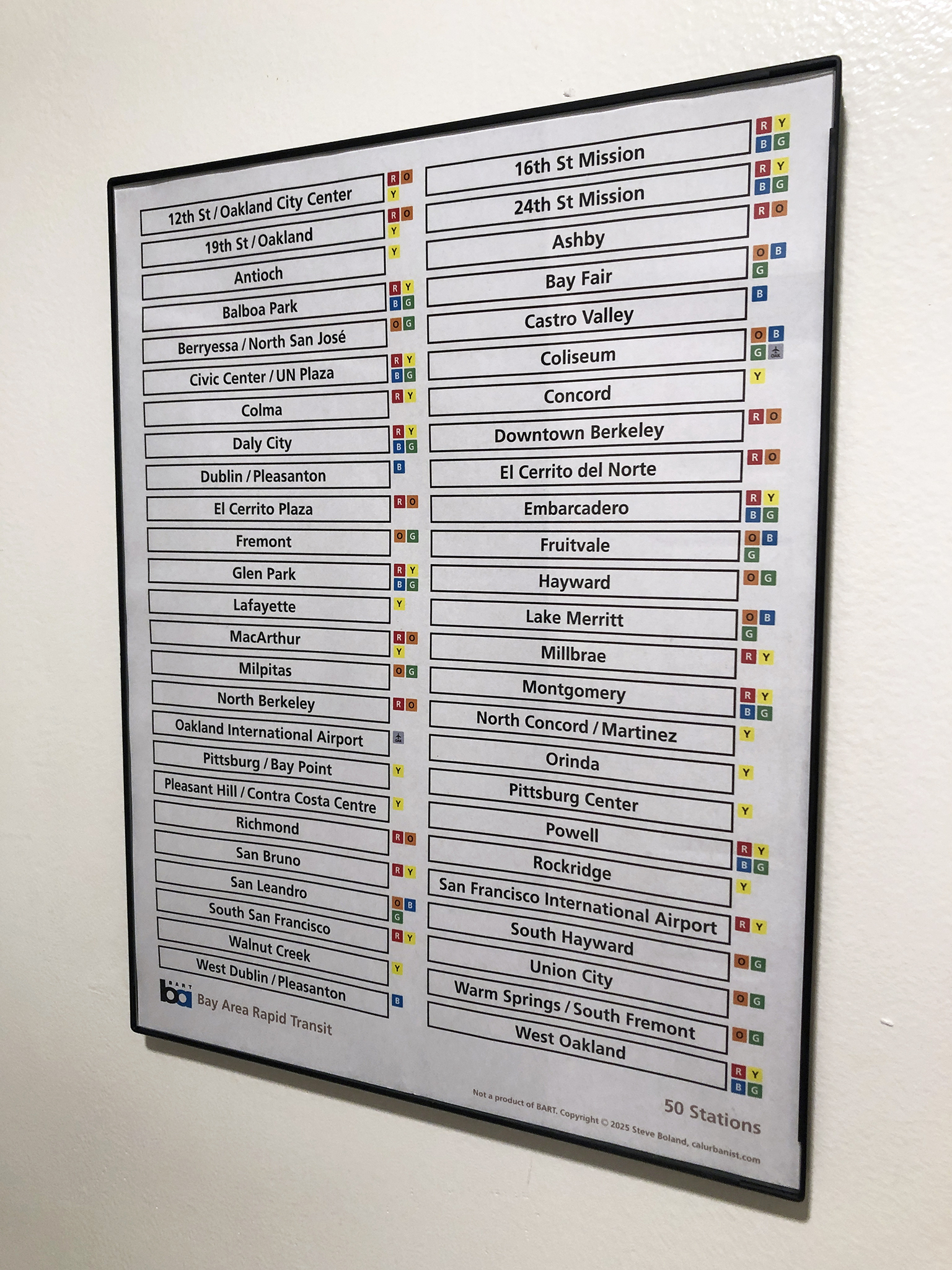
This map is based, obviously, on the current BART map. The typeface is Frutiger.
> View high-resolution PDF