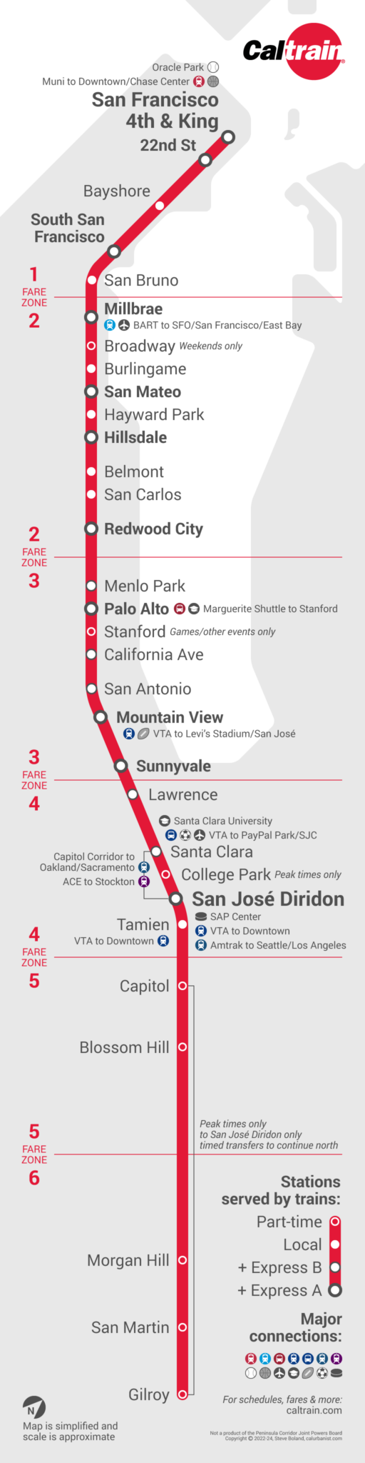
I’ve been living in the Bay Area for 25 years, and making transit maps for 20*, and this is the first map I’ve made of Caltrain. Until recently, Caltrain was a commuter rail line, but since it’s been electrified and service has been increased to every 30 minutes or more often all day, it now more closely resembles European regional rail, or at least one of the electric, fairly frequent commuter rail lines you find around New York, Philadelphia, or Denver. Because it doesn’t just run between the suburbs and downtown, but is bookended by two major population and employment centers (OK, Silicon Valley isn’t exactly a “center,” but you know what I mean), Caltrain is also busier than most commuter rail lines, with around 65,000 riders per day pre-pandemic. Should the Peninsula be served by a BART line? No — Caltrain should just be rebranded as a BART line (and otherwise improved, of course). (* You won’t find maps that old here because the early ones were … experimental.)
Notes on Design
The reason I’ve never done a Caltrain map is that despite its simplicity, I kept overcomplicating things — I wanted to make a map based on a string diagram, or one that showed every service pattern as a separate line (like this one) or connections as lines (like this one, but less green). In the end, I realized it was enough to simply fix the agency’s current map*, a throwback to the days before the Bay Area’s other major rail operators, BART, Muni, and VTA, got modern maps. The approach I settled on, of course, is a hybrid one combining some semblance of geographical accuracy with the look and feel of a diagram. The typeface is Roboto, which Caltrain uses on its website. (* Caltrain ticket machines and on-board screens feature nice, if basic strip maps.)
> View high-resolution PDF