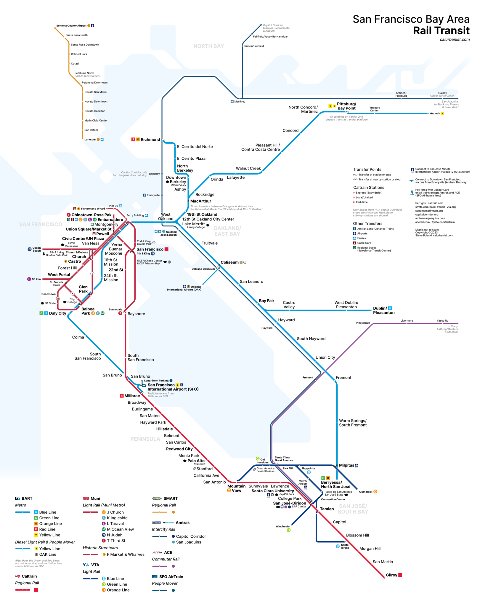
The New York City Subway, Washington, D.C. Metro, Boston T and Chicago El maps are effectively regional rail maps, even if they don’t show all of the rail lines in their regions. That’s because most of the transit ridership in those regions is on those systems. Here in the Bay Area, there’s BART, but there are also lots of riders on Caltrain and the Muni Metro (or at least there were, pre-pandemic), and there are a half-dozen more rail operators besides. And while BART‘s map shows non-BART lines, it’s not really a regional rail map — other lines are grayed out, in the background, and they’re so distorted it’s distracting. A region like this needs a real, integrated and comprehensive regional rail map. (Sidenote: MTC has unveiled previews of its own updated regional transit map, including express bus routes.)
Notes on Design
This has to be my fourth or fifth version of a Bay Area rail map. This latest iteration was rendered necessary by completion of the Muni Metro Central Subway, which greatly complicated the task of rendering the Downtown San Francisco rail network. Does my approach work? As opposed to, say, the approach taken by Muni itself? The latter is probably less confusing, although it requires a gap between Montgomery and Powell stations that disrupts the orderly procession of Market Street subway stations so familiar to San Franciscans. (Another sidenote: the entire Powell-Union Square/Market Street complex should’ve just been labeled “Union Square”.) The typeface is Inter, which was designed for legibility on small screens, and happens to bear a passing resemblance to Helvetica.
> View high-resolution PDF