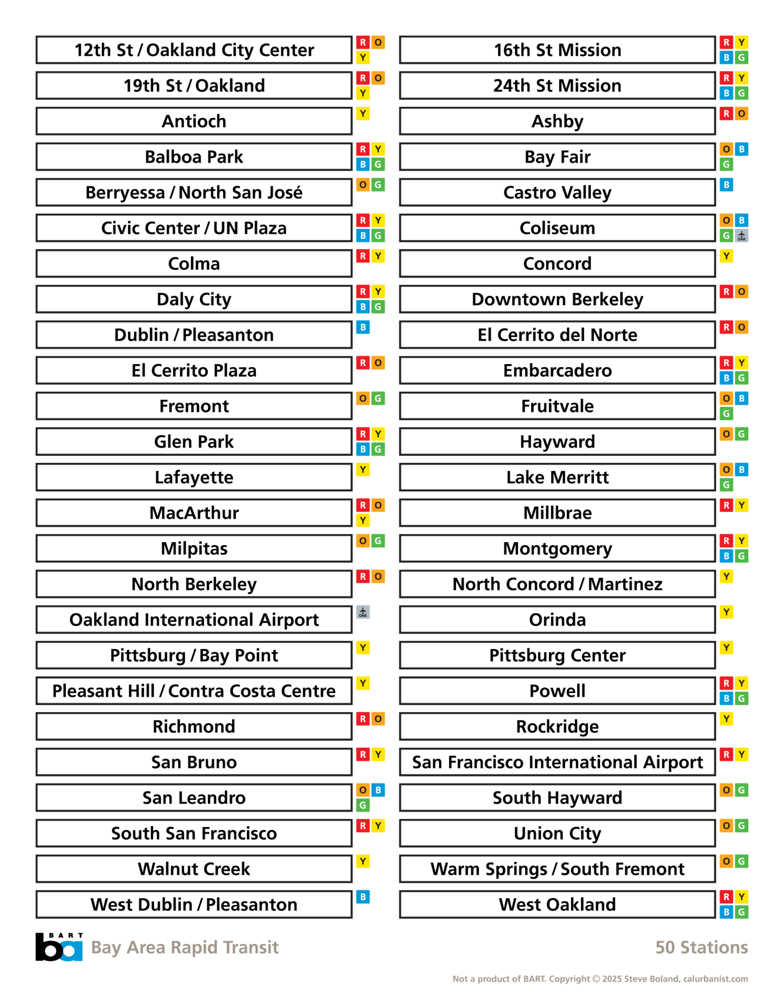
This poster was inspired by Hamish Smyth’s and Alex Daly’s NYC Subway poster. BART’s current station name signs include wayfinding icons, but not shields for lines serving the station, which I’ve added here. Some BART signs are also non-standard, and often times, BART can’t even figure out what to call its own stations — the BART map, online list of stations and platform signage may render up to four different names, if you include the original station identifiers that were never removed. Here I’ve tried to use complete names rather that the shorter versions on many station signs, although I just couldn’t bring myself to add “St” to Montgomery and Powell (most style guides do that for numbered streets, but it’s not “Ashby Ave,” is it?).
Notes on Design
The typeface is BART’s official font, Frutiger (specifically 65 Bold). This poster is ready to print at 11×14″.
> View high-resolution PDF